Definition
One point perspective is a type of perspective drawing, where everything converges on one vanishing point. This means everything will lead to one point, instead of multiple like other types of perspective, such as two point, three point, ETC.
Inspiration
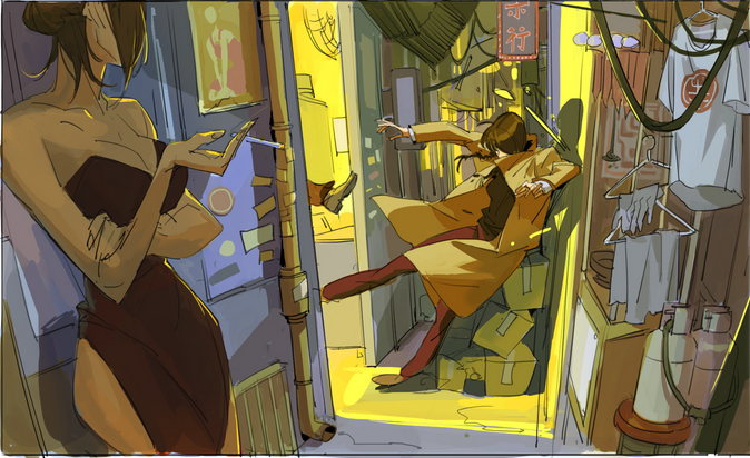
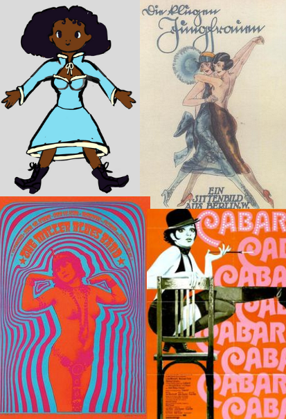
I’m not super used to environment pieces so I decided to base it on my own characters from a game idea I’ve been working on. the aesthetic is colourful and vintage-inspired. The initial inspiration was this piece by concept artist TB Choi.
I really liked the cramped chaos all leading into the subject, a person being attacked.
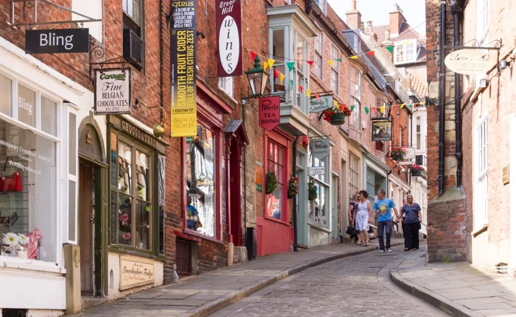
For my piece, I referenced pictures of British alleyways and small streets as well as more colourful and eclectic places like Lincoln’s Steep Hill
I decided to make the subject my main/player character, Farin, as I thought her swooshy skirt and the purple in her outfit would suit the aesthetic I was going for. Instead of the subject being kicked from the side, I decided to depict her chased by some small monsters.
Process
First I started by using a perspective grid, polygonal selection tool, and gradient tool I created the rough composition and added base colours. Then on top of that, I used a rough brush to sketch in detail, I added things like signs and different textures that I observed in the references I looked at.
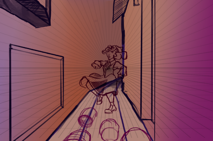
Then based on references of Steep hill and other British streets and alleyways I added more colour
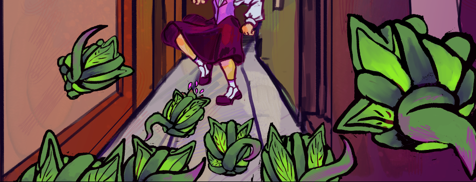
During this I also wanted to focus on the small monsters, in the story, there are a lot of monsters made by enchanted plants so I decided to do those, I also thought it’d be cute if they were based on cats.
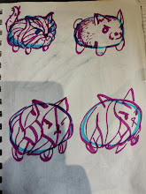
I tried different plant textures; thorny vines, moss, leaves and petals. I liked the vines and leaves the most, as I thought they made it clear it was plants and also had good shape language; a soft squishy cat but still pointy and dangerous. so I went with those. On the final design, I tried to make it look like it was constructed with vines then the leaves filled in the gaps.
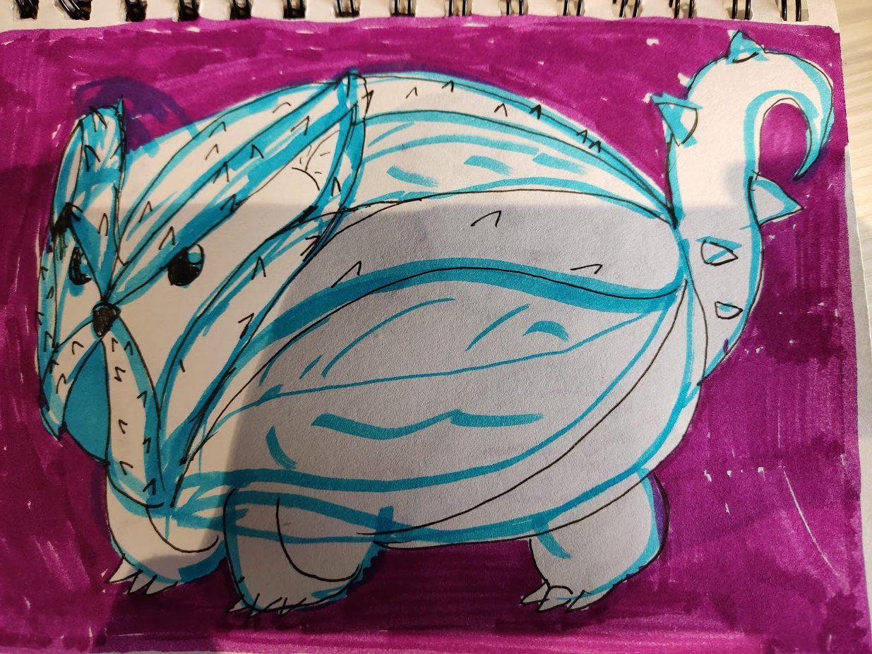
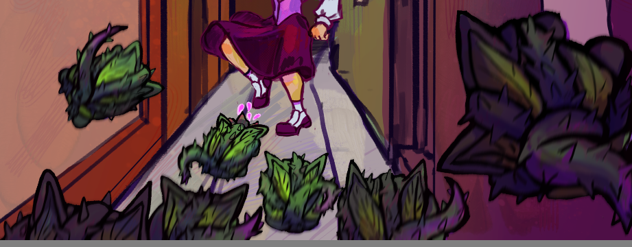
Next, I rendered the monsters, I coloured them green, as they are made of plants, and I created a gradient on the leaves as well as some purple hatching, as it’s a colour associated with the supernatural, to make the monsters more interesting to look at. I then defined the lines and used an overlay layer to change their colours depending on their position in the scene to add a sense of depth. I then duplicated them and added a motion blur effect to make it clear they’re moving at speed.
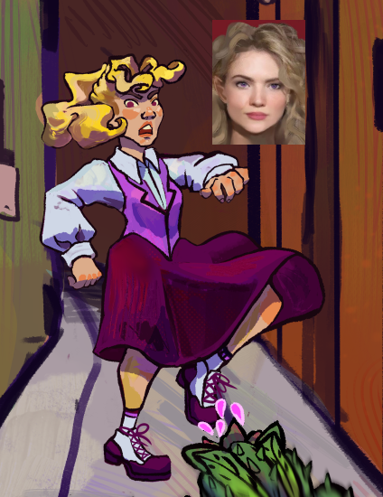
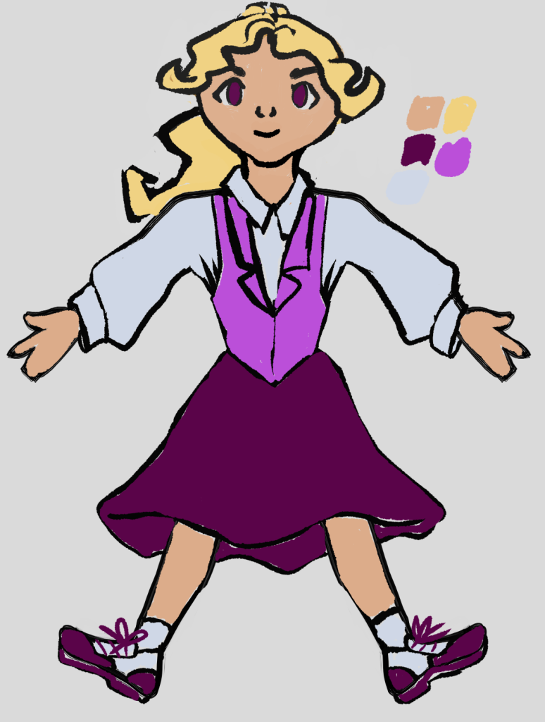
Next I concentrated on Farin, the subject of this piece. I wanted it to be clear she was manically turning around and running away from the cat monsters.
I started rendering her but was unhappy with the progress, I consulted my friends and boyfriend and It was pointed out the likeness wasn’t very good, as her eyes are the wrong shape and her head isn’t round enough.
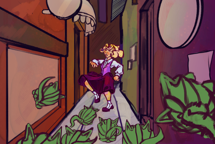
I corrected this and ended up with the image below.
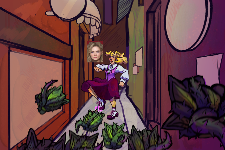
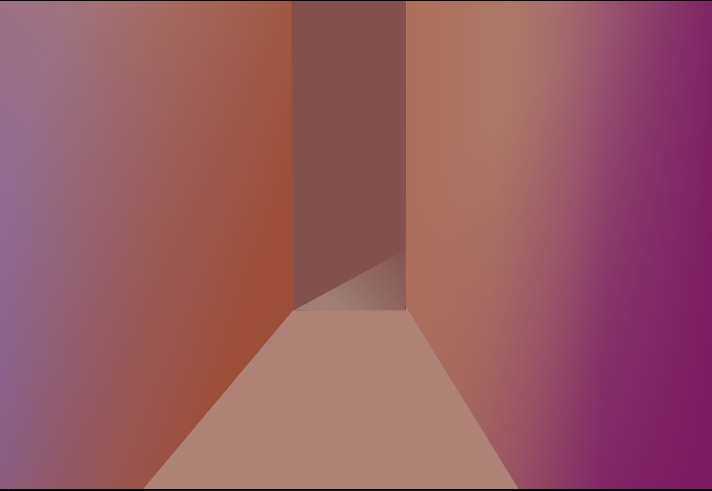
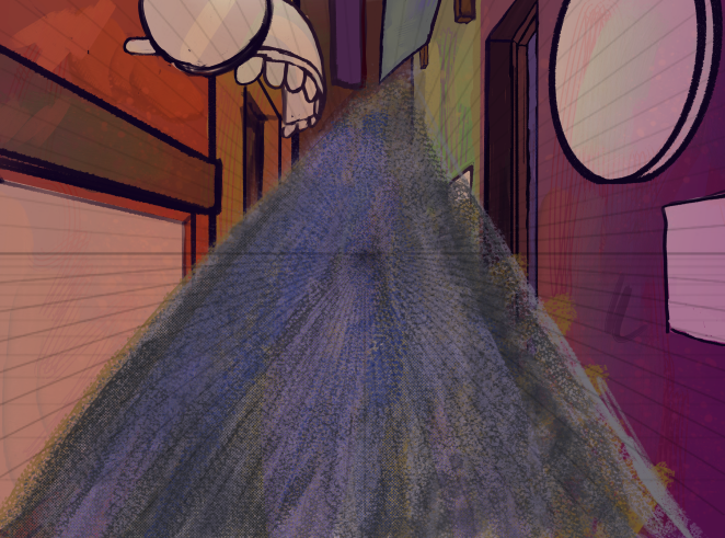
Next is the environment itself. First I started with the path. I realise now I did this wrong but I managed to make it work. I should have made a rectangle of texture, not a triangle. To do this on a new layer I used a bunch of rough textured brushes in de-saturated colours, I then perspective warped into the path, and then cleaned the edges to make the ground look like it was made of concrete or tarmac.
Next, I cleaned the edges to prepare for the next steps
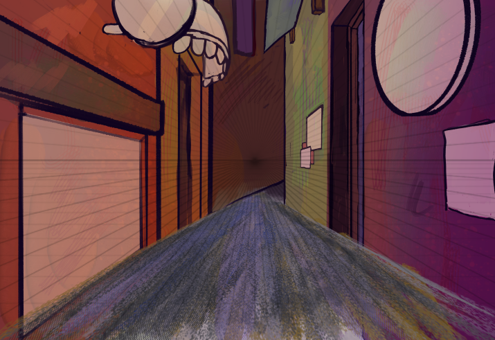
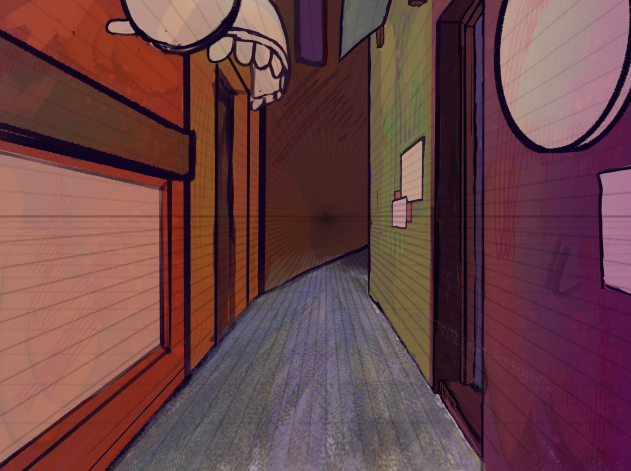
From there I cleaned up the environment and added different textures to the walls, to make it more eclectic and closer to many British streets. Then, there were a lot of plain bits; posters, murals, awnings.
for the mural, I decided to make it an advertisement, I collected references from vintage nightclub posters as it felt fitting for a cramped city alleyway. I also decided to make the character on the poster a character from the same universe. I did simular to the path as I drew the picture and then perpective tooled it into place.
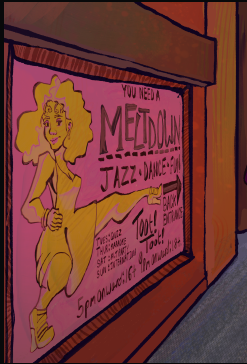
From there I referenced retro textiles and decorated the signs and posters. I used some of my old artwork on some of the posters to save time, with that and the new wall textures I ended with this:
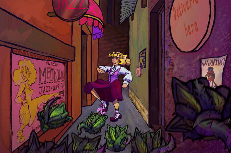
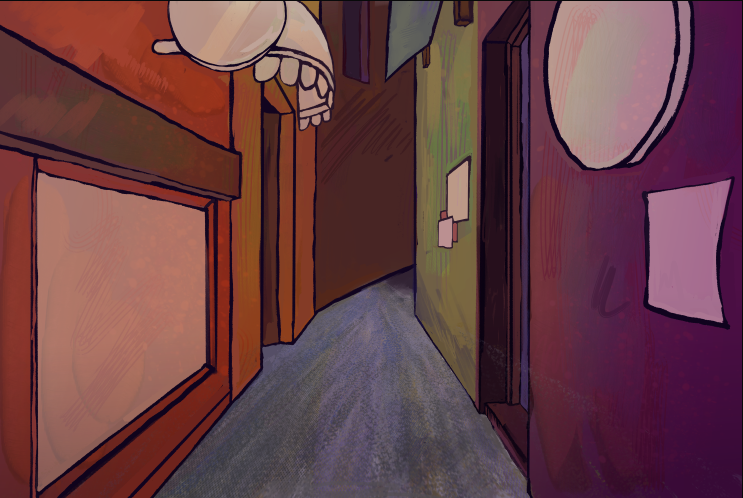
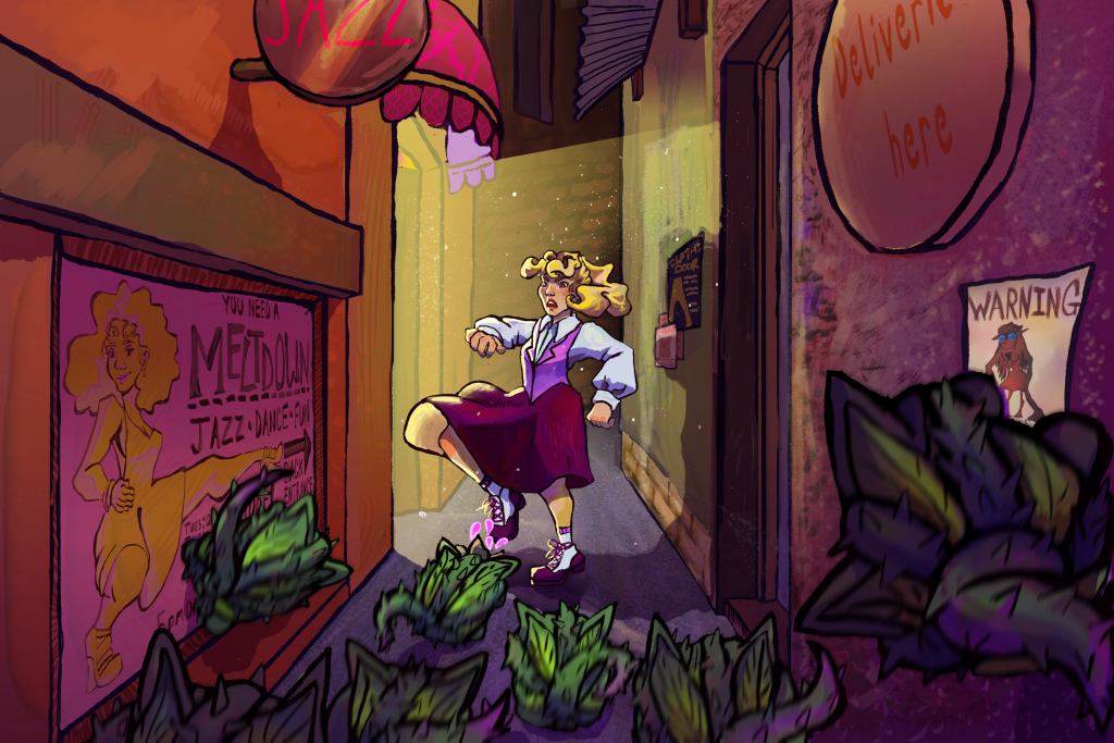
Now the peice was almost done but it didn’t feel cohesive, so I used an overlay layer to add a purple and orange gradients over the top of everything to make it feel more unified. Then I used multiply and screen to create lighting framing the subject, Farin, as well as making everything fit in the scene and it feel more realistic. I used the polygon select and gradient too to create the light, then used a scatter brush to create the effect of dust in the light.
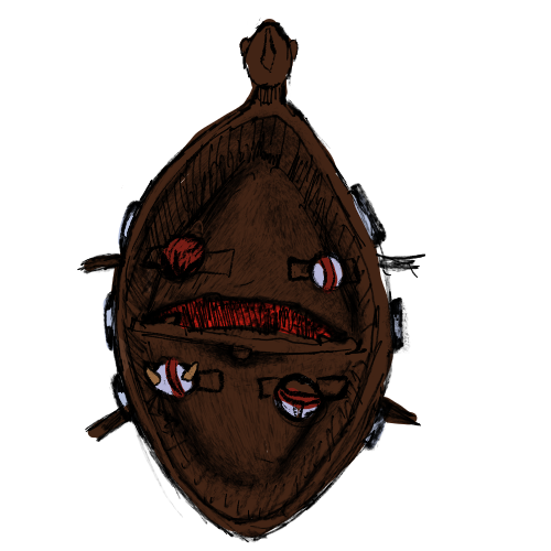
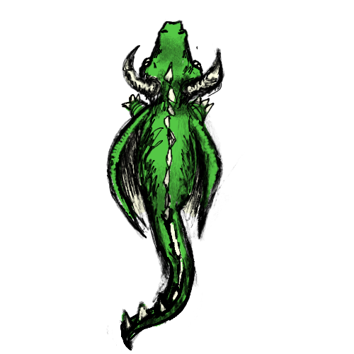
Space invader art.
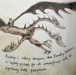
When I conceptulized my space invaders, I decided to go with a fantasy theme and quickly settled on a dragon defending its territory from vikings. This idea reminded me of one of my favourite child hood book series “How to Train Your dragon” I really loved the illustrations in those books, done by the author, Cressida Cowell. So I used them as the main reference.
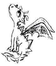
the illustrations have a very sketchy and rough quality to them so I used a graphite brush, and kept it very fluid and sketchy to emulate it and changed the line thickness to imitate how she used different pencils and would tilt the pencil to create different effects.
My assets
Leave a Reply