Colour Theory
Colour Theory is guidelines to help a designer communicate information and create appeal through colour. This can be through individual colours or colour schemes.
People will naturally associate colours with different emotions and feelings. Thus you can use this to influence the perception of a product, character, brand or piece of artwork.
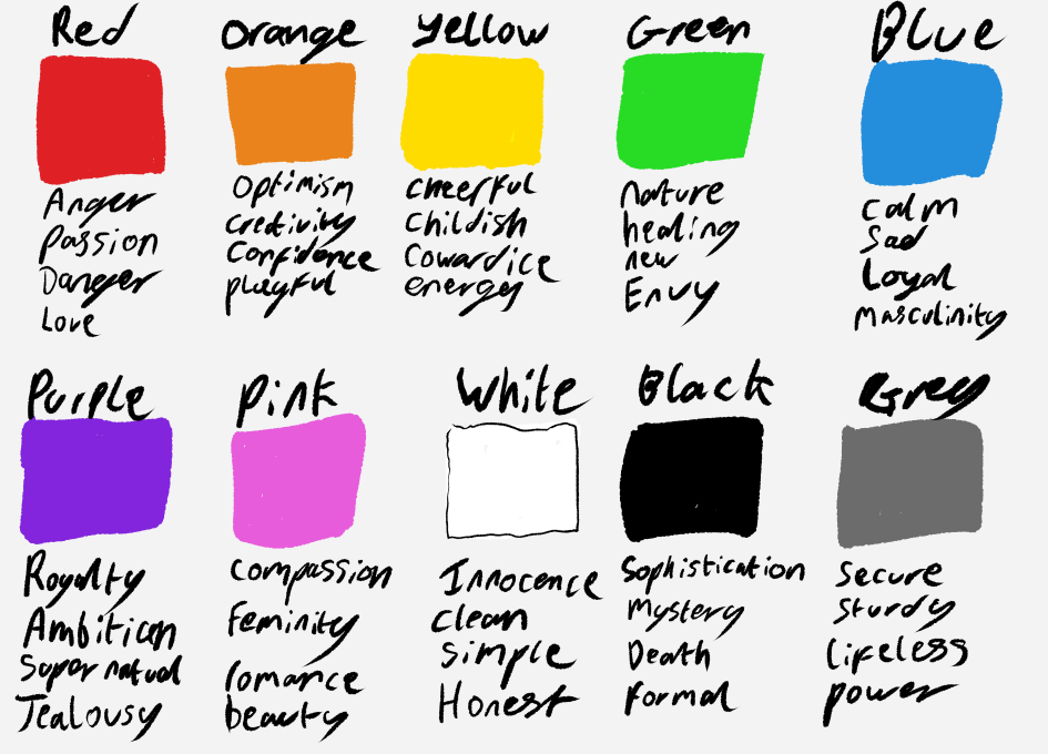
Now these can be changed depending on how you group them together and their context.
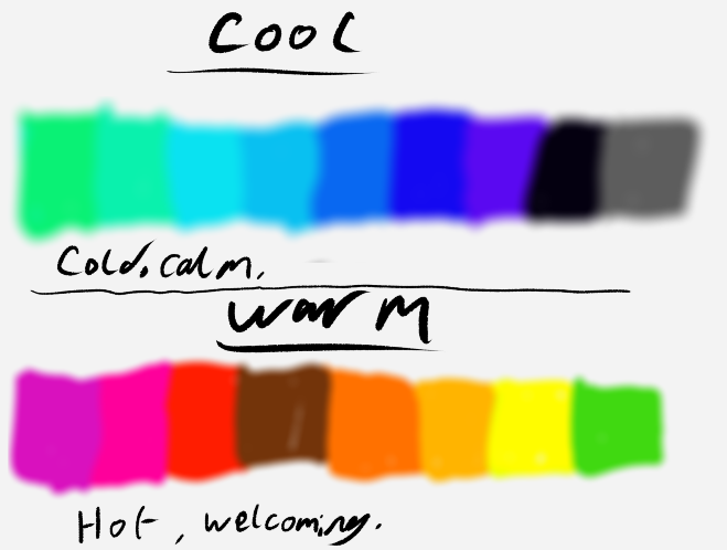
For instance, warm versus cool colours can create a dichotomy between different characters or environments in a game.
When talking about colours it’s also worth considering the setting and context.
As the context in which a colour is used can change the emotions associated with it.
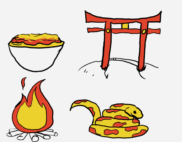
For instance here, Red and yellow are used in several different objects.
It’s causing hunger on the bowl of pasta,
They hold significance in many Asian cultures, in the example above on the Japanese Torii Arch it’s mystical and religious.
Then the fire it’s showcasing warmth, and the snake they feel more dangerous.
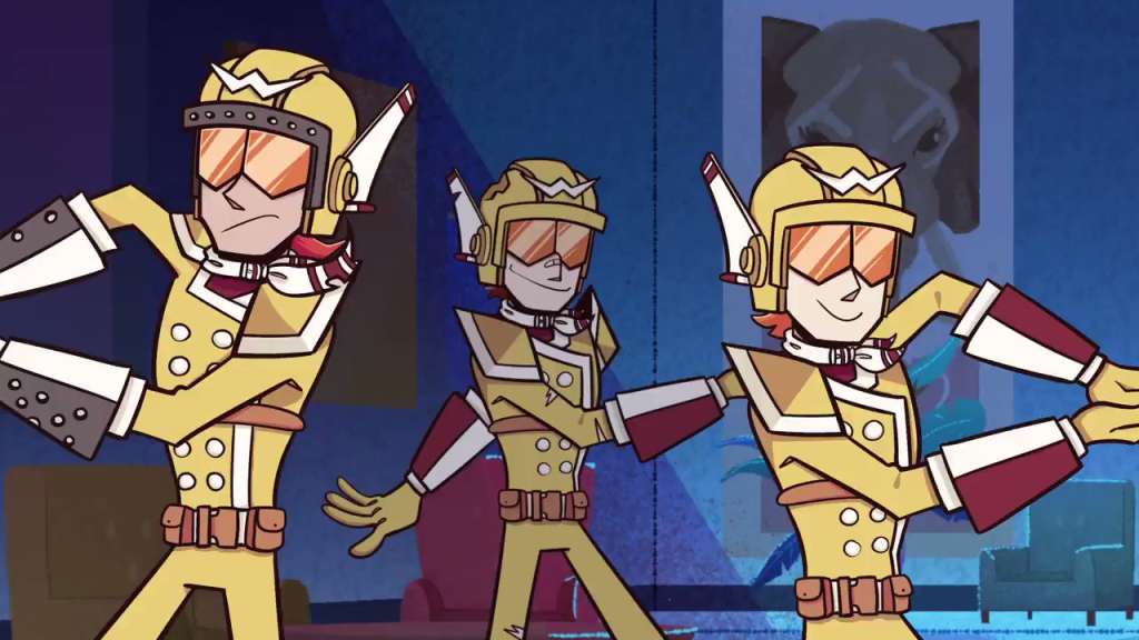
It is also fair to break these rules to a point and create a new context within your own stories.
For instance, in Epithet Erased, the crime group the Banzai Blasters all wear yellow uniforms, so yellow, in this show, causes you to remember them.
The final thing to consider is Hue, saturation and contrast. You will need to consider these when creating colour palettes, and it can also affect the mood of a colour.
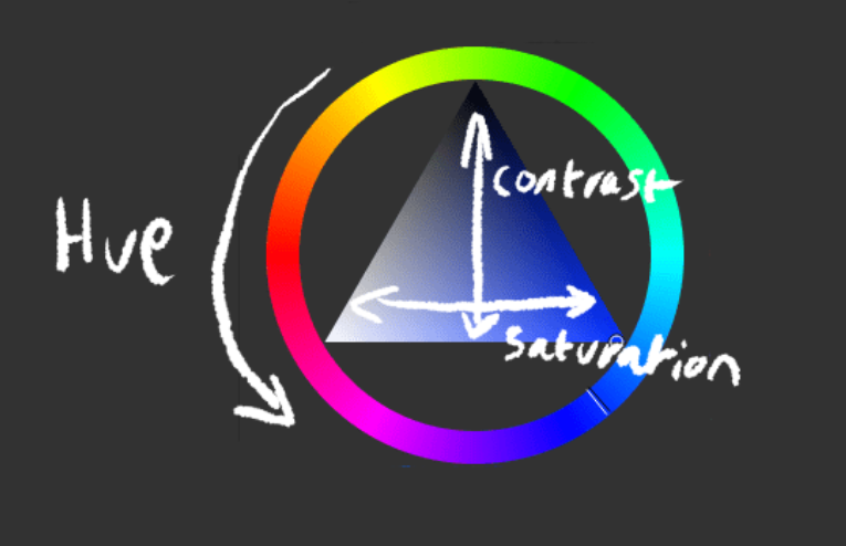
Hue, is the colour you’ve selected.
Contrast is how dark the colour is
Saturation is how bright or dull the colour is.
You can use these to manipulate the perception.
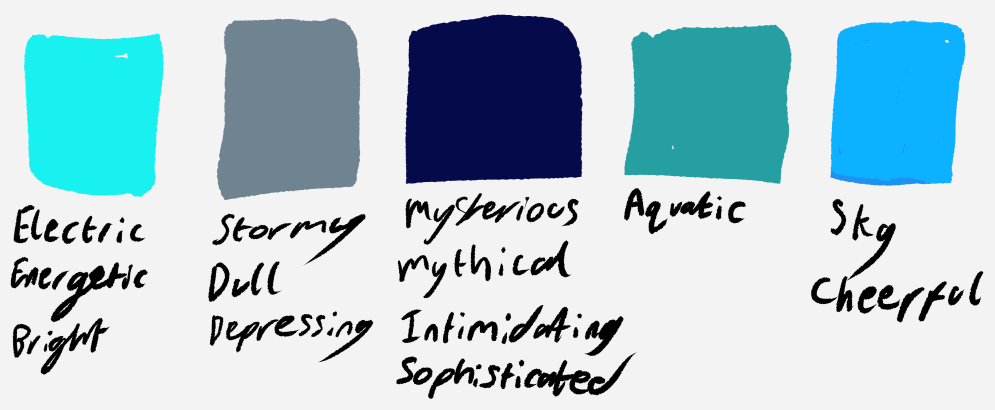
Just within the blues, you can get this variation, depending on how you change the hue, saturation and contrast.
Shape Language
Shape language is how you can use shapes to communicate things. This is heavily used in character design as it can completely change character perception.
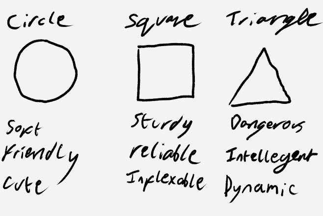
You can use these to communicate the personality of the character by using them to structure your design or how you render the character.
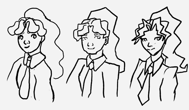
Here is the same character but drawn concentrating on using a different shape each time. As you can see it changes how the character comes across.
Top Down Shooter Assets
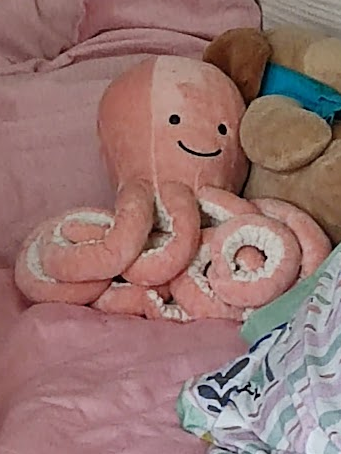
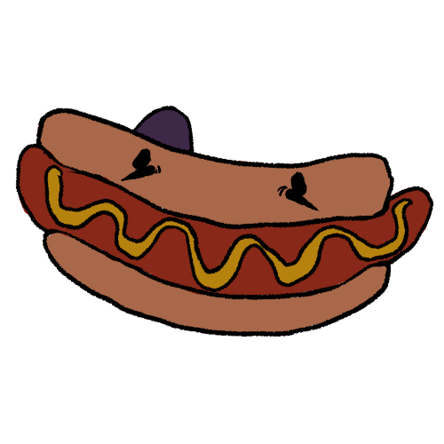
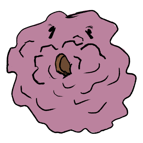
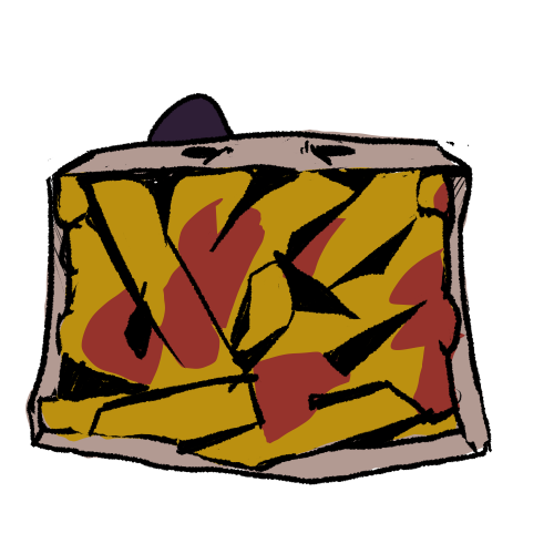
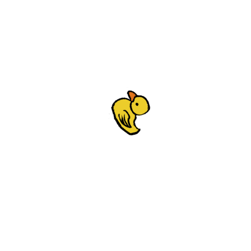
My top-down shooter was based on Hull Faire. With a plushie, Julius the Octopus, I won in hook-a-duck being the player character, and the food being the enemies.
I wanted to keep the game’s aesthetic grungy and gross so I used mostly muted and rich colours. I also kept the lines thick and dark as well as slightly wobbly to add to the uneasy and dark feeling.
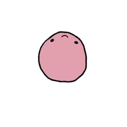
For Julius I used a muted pink, to keep loyal to his design but not make it overly cutesy.
For shapes, I used rounded shapes to contrast the enemies and make Julius seem friendly in comparison.
I drew the head separate from the body so the head could follow the cursor.
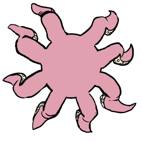
For the animation, I made a simple walk animation, although as simple as it is for an 8-legged creature. I used frame-by-frame animation.
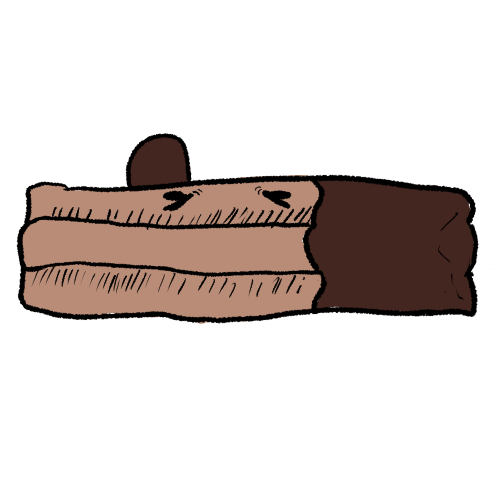
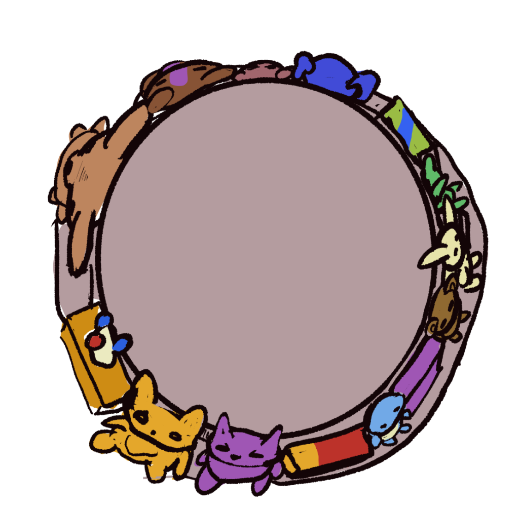
The enemies I based on commonly found food at the fair. I tried to use straight lines and more angular shapes to make them contrast with Julius. I also used a multiply layer on green over the monsters to make them seem grosser and rotting.
For the shooting, I decided it’d be fitting for the game to be goofier considering its characters, so I decided to have Julius spitting rubber ducks.
Finally, for the level, I wanted to make it set in a Hook-a-duck tub, as it was the stall I got Julius from. To keep it simple I decided to just make a pillar in the centre, to add to the circular feeling of the stalls, I decided to put toys around it as the prizes that had not yet been won, and make it clear it was a fair stall.
Leave a Reply